


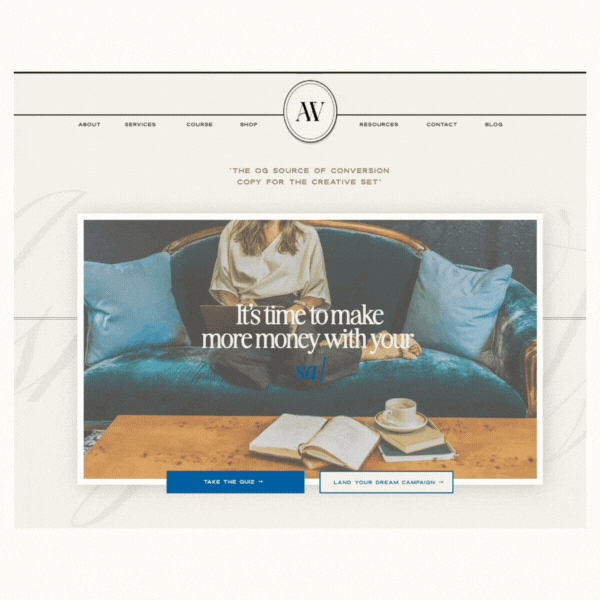
You’ve got the offer, the testimonials, and the confidence—but is your sales page doing the heavy lifting? I’m about to drop some truth that’ll change how you approach your next launch.
As a brand designer, I’m here to let you in on a little-known secret that the pros use to create sales pages that don’t just look good—they convert.
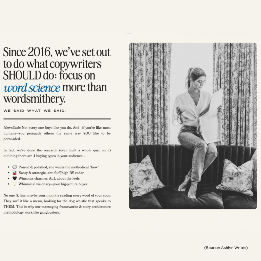
And let’s get one thing straight: Nobody—and I mean nobody—is reading every single word on your page. Yep, not even your biggest fan (or your mom). Research tells us that only 16% of people read web pages word for word. The other 84% are skimming, hunting for the key points that matter most to them.
So, while it’s true that copy dictates design, it’s important to remember that 80-90% of information is still communicated through visuals, not words.
In other words, it won’t matter how amazing your copy is if your page layout is confusing, too busy, or poorly designed—people will bounce faster than you can say “conversion.”
So, What’s the Design Secret?
The secret is simple: Design follows copy. You don’t design a page and then squeeze the copy in like an afterthought. Your words—your story, your message, and your irresistible offer—should dictate how the design unfolds. The visuals, colors, fonts, and layout? They exist to make your words more powerful, not the other way around.
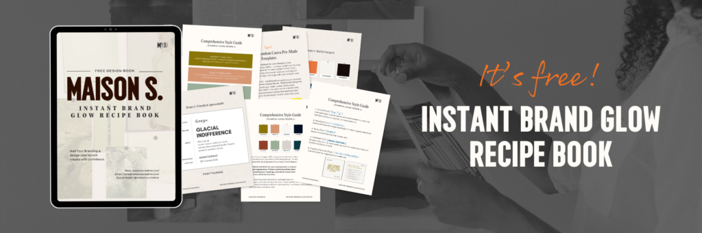
Side note: Download this FREE Instant Brand Glow Recipe Book to nail your branding & design your visuals with confidence. (6 branding templates & font pairings included)
If you’re thinking, “Well, can’t I just throw it all in a Google Doc like some coaches recommend?” Sure, that’s a popular hack for those with established, trust-filled audiences. But if you’re not in that big-names category yet—then you’re missing out on what a well-designed sales page can do: build trust and guide the reader to a confident yes.
The Function of a Sales Page
Let’s break it down: a sales page isn’t just there to look nice—it’s where potential customers decide whether to buy from you. A decision that’s built on trust, which you build through a combination of persuasive copy and strategic design. Your goal is to make your audience feel understood, secure, and ready to click that buy button.
Here’s the truth: people do judge a book by its cover, and the same goes for sales pages.
Your audience be like 👇🏻
Research shows that 94% of first impressions are based on design alone, and 75% of users assess your business’s credibility based on your online platforms’ appearance. If your sales page is outdated, cluttered, or looks homemade, you’re setting yourself up for an uphill battle in earning trust.
To win over your audience, ensure your sales page is polished, user-friendly, and reflects your brand’s professionalism. This way, you’re not just selling a product or service—you’re making a compelling case that you’re the expert they can rely on.
My Proven Design Tips for a High-Converting Sales Page
Now, let’s get into the juicy part. I’m not just here to talk theory—I want to give you practical, designer-backed tips to turn your sales page into a conversion machine.
1. Get Visitors to Stick Around:
You’ve got just 7 seconds to make a good impression. Use subtle motion graphics, arrows, and videos to draw attention to key sections. Want to turn more visitors into potential buyers? Guide their eyes with visual cues like directional arrows or images that naturally lead the eye.
2. Break It Down:
Long paragraphs are instant snooze material. Stick to short, punchy sections—3-4 sentences max. Use headers, bullet points, and bold text to make it easy to skim. Remember, you’re designing for scanners, not readers.
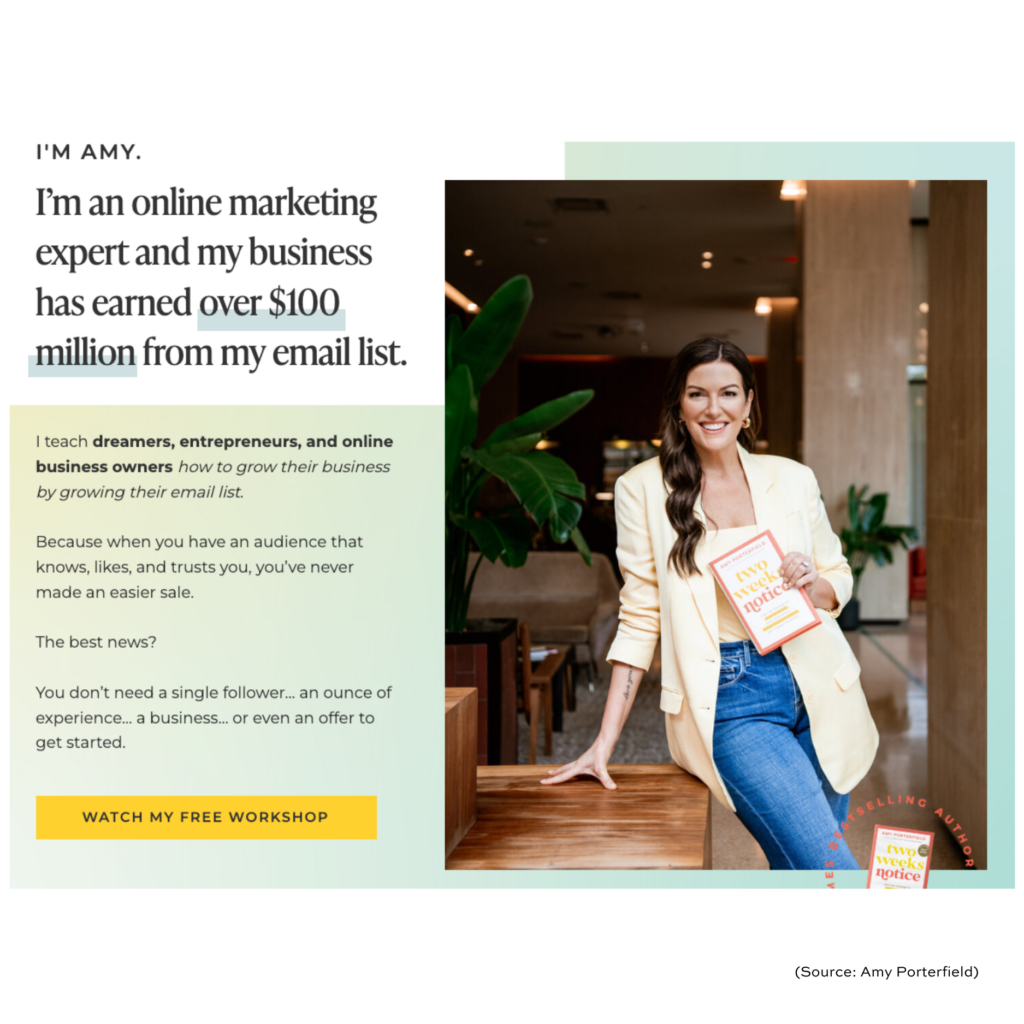
3. Invest in Professional Photography:
Professional pictures don’t just increase your brand’s credibility; when used correctly, they can also evoke specific emotions such as excitement or curiosity and improve reader retention.
4. Testimonials that Pop:
You’ve got glowing reviews? Great! Don’t bury them in tiny font at the bottom of the page. Pull out the most impactful part and make it BIG. The goal is to let your audience see social proof before they need to search for it.
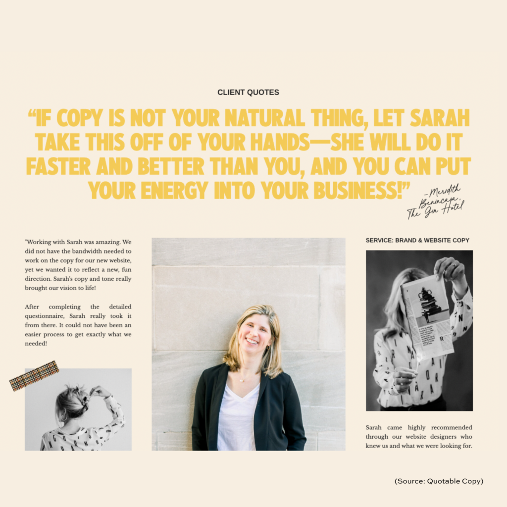
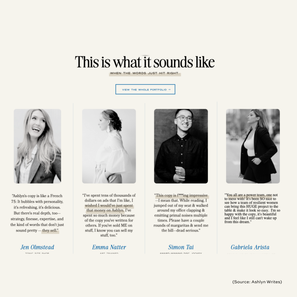
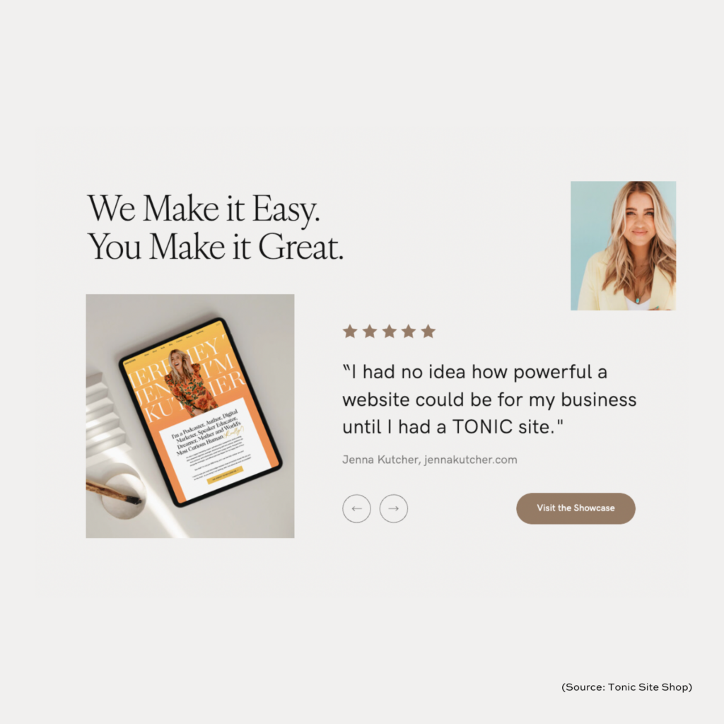
5. Strategically Place Social Proof for Impact:
92% of consumers trust peer recommendations more than ads, so you want your testimonials to work hard for you. Design your page to feature social proof prominently, ideally near your CTA. Break up longer sections of copy with testimonials or client logos/ headshots to keep the momentum going and reinforce trust throughout the page.
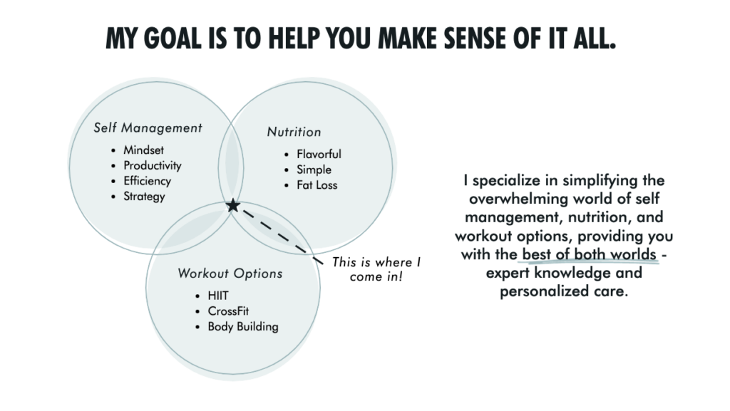
6. Incorporate Data Visualization for Trust
If you’re an expert offering coaching programs or courses, integrating data visualization increases user retention by 323%. Adding infographics or simple charts to showcase results, course structures, or client success stats makes it easier for visitors to understand the value you’re offering. Visually representing key data points helps establish authority and simplifies complex information, enhancing credibility.
Here’s one of our client’s examples:
7. Keep Your CTA Consistent
As an online business owner, you want your audience to follow a clear journey from the first glance to the final purchase. Studies show that 76% of consumers want easy navigation. This is particularly important for your sales page. Your sales page has ONE goal: to convert. Don’t include multiple, different CTAs like links to your About page, free resource page, etc. Keep all your CTA buttons consistent. Want them to buy? Lead them straight to the checkout page. Want them to book a call? Direct them to your calendar link. Don’t send them to pages that don’t support your primary goal: to sell.
The Bottom Line: Design That Serves Copy = Sales
The magic formula for a high-converting sales page is simple: strategic design that serves the copy. When your words and design work together seamlessly, you’re building trust, creating an emotional connection, and ultimately guiding your audience to take action.
Ready to revamp your sales page for more conversions?
Your first step is to nail your branding. Only then can you create a professional-looking and consistent sales page.
Download this FREE Instant Brand Glow Recipe Book to perfect your branding and confidently design your visuals. This free resource will help you:
💅🏻 Nail your branding
👩🏻🎨 Design your launch visuals with confidence and consistency
🧡 Turn more people’s heads & get more people to participate in your launch


LEAVE A COMMENT +
LEAVE A COMMENT +